EVALUATION - QUESTION 1
- Jan 3, 2017
- 10 min read
In what ways does your media production use, develop or challenge forms & conventions of real media productions?
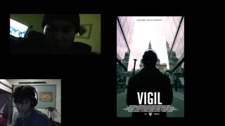
Forms and conventions are rules that make a trailer a trailer and not something like a soap opera. Conventions help an audience recognise what type of media product it is, and whether they will consume it or not, some examples of conventions include Cowboys being the main characters involved in Western movies, wearing leather boots, hats, and carrying pistols or guns. Shootouts may occur between the protagonist and the antagonist, and the Cowboys could meet-up in a place like a saloon. My own media production, the action trailer film 'VIGIL' had also used, developed and challenged the forms and conventions that exist today.
To start off with, I will be analysing my trailer:

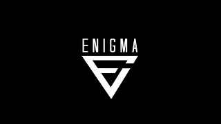
At the start of the trailer, I had included a short graphical sequence that contains the logo of my movie production company, 'ENIGMA ENTERTAINMENT', this short clip was made in Adobe AfterEffects and inputted into Adobe Premiere Pro. The buildup of the logo links to the plot of the film, as the glitch effect may hint at a story element that may be involved within the film or short trailer, such as hacking, or a complicated matter that the protagonist will encounter. The logo itself also shows the sophistication of the production company involved, as it is a rather unknown company, new viewers would be instantly drawn to the short animation, and their attention will then be turned to the trailer.

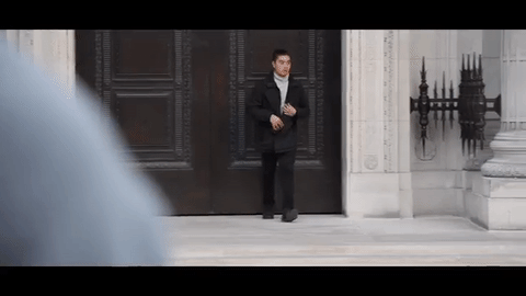
We then see a short montage of clips of the main character/protagonist, Mason, going about his own daily life, the settings or locations of the scenes that he is seen at are quite urban and also mysterious. As he is first seen going through a rather bleak hallway, then up the elevator, and finally observing a painting of some soldiers celebrating a victory. The camera is intentionally always behind the protagonist, making him seem more cryptic as he we as the audience do not really see his facial expression. I wanted to hint at the idea that my protagonist was a part of something much bigger than himself, and that he is not whom he seems to be.

It then cuts to a short sequence of cars passing quickly by Trafalgar Square, whilst it may suggest that time is passing due to the speed of the shot, it also reveals that the story is set in the cultural capital city of London conforming to the stereotype of the action-thriller genre as most of these films are set in high-populace urban cities were scenes such as gun-fights and car chases tend to happen, it also connotes that the story relates to those of a higher class who are able to live in the central areas of London, known for being relatively expensive to live in; this also makes my protagonist seem alot more sophisticated. The camera then cuts to a steady-shot of a close-up of a camera, giving the idea that you are always being watched, no matter where you are, or what you are doing; which is a central theme to my film.

The first reveal of the trailer is seen as it shown in a slow zoom out that our protagonist is being followed and observed by someone who appears to be dressed in a dark hooded jacket, this gives off the impression of someone who doesn't want to be noticed, and with Masons troubled facial expression as he senses danger and asks his friend about his troubles, we are inclined to believe that the protagonist will soon face or encounter a major challenge. These scenes pose a question to the audience of who the character that is following Mason is, enticing them to watch more of the trailer to find out. We had shot our protagonist just outside the building of a high class establishment near Holborn, this makes our audience believe that Mason is a part of something big, adhering to that level of sophistication that is associated with the people who reside in Central London.

The trailer then enters the mid-point of its story, as there is a slow pan away from Mason who is stood firmly behind a wall to unveil that he is now the one who is waiting for the person who is following him, disclosed to be a government antagonist that is tracking Mason. This makes Mason seem even more intelligent, as he is able to tactically out-wit his opponent who thought that he was following him the whole time. You can see that the scene was shot at mid-afternoon, contrasting with the day-light shots of the previous scenes, making it seem as if time was moving chronologically, adhering to the linear narrative structure. In this films case, it relates the most to Todorov's theory of narrative, as he states that most films start with a state of equilibrium, which is then disrupted by an outside force and has to be fought against to return to its original state of equilibrium. This is the case for Mason, who was living quite an ordinary life until he realised he was being observed and followed.


We then see that Mason is not afraid to confront his foe head-on, and is strong enough as the dominant male protagonist to threaten the current antagonist to try and find out about why he is being followed. These short cuts and fast paced editing are stereotypical of the action genre, making the scene more dramatic and intense, as people realise that the situation is serious. After the confrontation inwhich Mason has knocked the character out, it appears that Mason finds all the information he needs, scrunching up a piece of paper to which the audience do not know the true contents of. I intentionally made the scene alot more enigmatic, as I wanted people to try and decipher the meaning of the scene for themselves, and not give away too much information that is central to the plot, as mainstream trailers tend to do today.

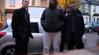
We now enter the final stage of the trailer as it is shown through a variety of close shots that a sting-team has been assembled to take out Mason, we get this from the ominous suit clothings that the agents are wearing, establishing the fact that the situation is urgent, and they need the man-power to outnumber and essentially kill Mason; which is suggested by the fact that an agent seems to be carrying a handgun or pistol. A prop that is iconic to the action genre and connotes themes of death and violence, which is explicitly present in my production.

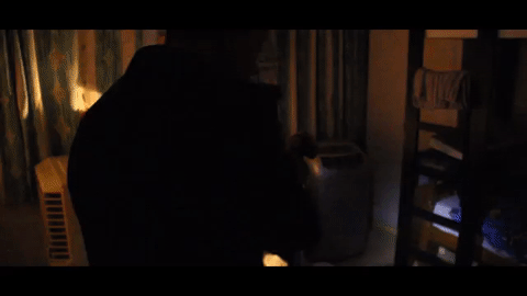
It is then shown through a series of clips that the agents are intruding into the home of what appears to be the Protagonists, carrying flash-lights, as the house is pitch-black in darkness, making it seem more ominous for the agents, who are trying to keep an eye out for Mason. Who they know to be a huge threat.

Before this happened however, it appears that Mason was already ready for this confrontation, one step ahead of the antagonists before it even began, as it seen through this sequence that it was still light outside whilst this clip was taking place, giving the audience the information that Mason is ready for the appearance of people invading his home, and he is armed with a gun.
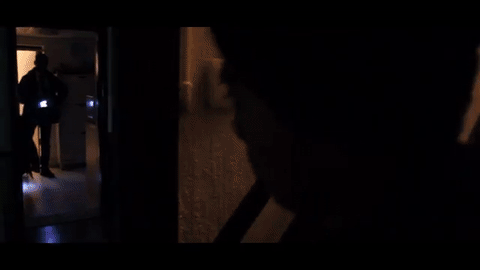

What follows is a massacre of the antagonists, as Mason slowly begins to take them out one-by-one, showing his prowess in combat with his fists, his gun, but most notably his wit, as he knew the only way he would win and overcome the numbers, would be to slowly whittle them down that would make the fight advantageous for him, as he would be able to take them on in a one on one fight. Tracking was used extensively throughout this clip, from the point where Mason fires his gun (And muzzle flash is used to make it seem more realistic) to the point where he fights with an agent in his kitchen and deals with him with a knife. This tracking movement puts the audience in the perspective of our main character, and also in-turn, gives them an indication of how fast paced and thrilling the sequence is.

It finishes with a title sequence of the name of the film trailer production 'VIGIL' which means, 'to keep watch', applying the central theme of the story to the title, which is that you are always being watched in this world. This sequence was also created through Adobe AfterEffects and then edited through PremierePro.

... However, a post-title clip is revealed, as Mason reveals that he "remembers", what does he remember? What happens next? It's up to the audience to find out, and they should find out by watching the film for themselves.
NOTE: The soundtrack of 'Everybody Wants To Rule The World' was played throughout the trailer and was synced to the cuts of the trailer. The music itself linked with the message the trailer was trying to represent, and also helped make the trailer a more stimulating experience.

My poster uses and also challenges existing conventions. Whilst I had based my poster on the mainstream Hollywood production movie posters that you may see today, I have also removed several features from the poster to my own liking. As my film production is an independent film, released and produced by students who do not have the funds to compete with the market and invest in a-list actors, I had chosen to not implement the names of the lead actors who had featured within the trailer on the top of the poster. This is because on a global scale, people will not recognise the names of the actors included in the movie as they are unknown and upcoming actors. For this reason, people may become dissuaded from watching the movie. If you keep the names of the actors a secret, people may want to find out the names of these actors or learn more about who features in the movie through other platforms such as the website. It helps build a fan base for the actors who have featured in the movie and gives them the attention they deserve. However, I had instead placed a slogan on the top of the poster that suggests the statement "Nothing lasts forever" - the slogan is meant to indicate to the viewer what the film is about and try and convince them into watching the movie.
The model is of my main protagonist Mason, who is played by Dylan Bade, he is presented with his back to the audience, looking toward a building in the distance. I challenged the stereotype of the protagonist in the frame, looking toward the audience, as not only did I not want my target audience to know the identity of the protagonist until they have watched the film or trailer, but it also makes the poster seem more mysterious and eerie to the viewer. It also ties in with the fact that the actor is unknown, so it makes his identity even more deceptive to the viewer, giving them an experience that they need to witness for themselves if they want to figure it out. We decided that having the main character as a male would be more effective, although it is more conventional, it is appropriate for the audience that we are targeting for our genre. However, we had also challenged the dominant stereotype by having the male come from an oriental Asian ethnic background rather than a White ethnic background, which gives the audience something different that can appeal to them. The costume of the main protagonist is quite dark, and it is unclear to the audience as to what he is actually wearing due to the lighting of the shot, this makes him more conspicuous; making it hard for the audience to tell what kind of character the person has. The location of the poster is set within Central London, giving the viewer connotations of a high-quality city life possibly involving elements of crime and mystery.
The layout of the poster remains relatively the same as an existing high-class Movie poster that exists today, it follows the simple layout of a viewer looking from the top-to-bottom of the poster. The image of the protagonist is clearly the largest point of attraction on the page, as it is meant to draw the attention of the audience. This is followed by the title of the film, giving people the indication as to what the title of the film is, so that they are able to follow the film through things like social media or the internet. Finally, the call-to-action, website, movie production logo, and the credits are located at the bottom of the movie trailer. These are conventional elements that are present in most movie posters today, and I decided to use these conventions as they are essential to the success of a movie poster. The call-to-action makes a viewer aware of when the movie is coming out or releasing in cinemas, giving them a date to schedule their time around so they will be able to watch the film, the website allows them to garner more information about the film through an alternative platform, if they want to know more about the film before deciding to watch it, and finally, the movie production logo and the credits give them an idea about who worked on and produced the film. The actors and people listed aren't that popular, so the text is smaller as it is the least important element on the page for the viewer to remember.

My magazine front cover also uses and challenges the existing conventions of magazines that exist today. My magazine was specifically based on 'Little White Lies' an internationally distributed movie magazine. The design of 'Little White Lies' is often inspired by the feature film on the front cover, often represented on the cover by an illustration of the main actor. There is a very minimal amount of detail listed on the front cover, as it is mainly focused on the illustration of the movie that the magazine issue is promoting. I tried to replicate style within my own poster, taking my own primary image that I had taken before in one of my photo-shoots, I was able to stylise the image into a illustration on PhotoShop. This illustrative style conforms to the stereotypical style of magazines such as 'Little White Lies' but contrasts with the more realistic style of more well-known magazines such as 'EMPIRE', where there are more details that cover the front cover such as titles, sell-lines, and even quotes. Within my own poster, I had decided to include some elements that are usually seen in most magazine front covers, such as the title of the magazine, the bar-code, the issue number, and a short message as to what the magazine may have inside. All of this information is stored within a triangle-shaped box on the top-half of the cover. Rather than using a strong, striking word such as 'EMPIRE' as the title of the magazine, I decided to be abit clever, and use the phrase 'What Lies Below' instead, as my title would give the reader an indication as to what the contents of the magazine may actually be. The colours used may not link to the house-style of the trailer and the poster, as this magazine cover is aimed at a niche target audience market, so I wouldn't need to worry much about linking the products together.
Overall, I believe that all of my products use, challenge, and develop existing conventions of real media productions through a variety of ways, and each of them are successful in their own rights.


Comments