MAGAZINE DESIGN
- Dec 8, 2016
- 3 min read

This is my magazine design that I had constructed from scratch. It first started from an original sketch that I had created through PhotoShop, I then built up each of the elements through the many layers. I based my magazine cover approach on the magazine of 'Little White Lies' as I really liked the simplistic and minimalist approach that surrounded the design of its front covers in regards to film. I find that many mainstream films that are promoted by magazines such as 'EMPIRE' tend to clutter the page with large bold text and images, which could distract the reader and make the magazine less appealing to look at. With a more simplistic design, people will know what to instantly look at, and can gain a more distinct image of the film with ease.

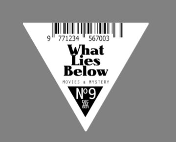
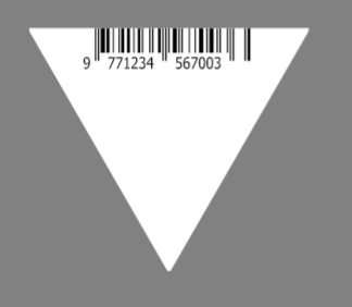
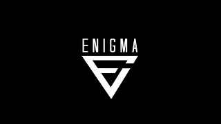
The logo was created in a separate document, it first required me to create the shape of a triangle, or a pyramid, which was done easily using the pen tool. From then on, I was then able to implement the stock image of a random bar-code, which I had found whilst searching the internet. I could then add the text that would be inserted within the triangle. I made the title of my magazine, 'What Lies Below' - I wanted a clever title to entice my audience into reading the magazine, and giving them an indication as to what details the magazine may entail. 'What Lies Below' suggests to the reader that the magazine may contain complex details about the film featured on the front cover, that the reader may not know about, this could include behind the scenes information, interviews, how certain scenes were filmed and other miscellaneous information. I was then able to add the price of the magazine, and the date of when the magazine was issued, which are typical conventions that are generally included within a magazine front cover. This triangular shape that contained the main information is one of the two main elements that make up my front cover.
The other main element was the visual image itself, it was a primary image that I had taken of my protagonist, Dylan, in an alleyway that people may notice from the media trailer. I was able to photo-manipulate the image in Photoshop, enhancing the lighting and brightness of the image using the levels tool in image adjustments. I then stylised the image in an illustrative manner, by applying a certain filter to the image that was present in the filter gallery. Once the filter was complete, the image was stylised in the simplistic and minimalist way that I wanted to achieve from the start. The colours that were already displayed within the image were to be the main colours that I would use to construct the magazine front cover; as the magazine front cover would only appeal to a niche audience, I could make the magazine appear as different to the movie poster as possible.
Below you can see the various stages of production that led to the final magazine design. It includes the image that I used, how I constructed it, the filters I discovered, and the different elements that I may have altered. All of this was done to adhere to the minimalist stylised direction that I was going for in my magazine front cover.


Comments