PRODUCTION COMPANY LOGOS
- Oct 15, 2016
- 1 min read
Here are example of several Production company logos that I like, I really like the monochromatic colour scheme used and the simplicity of the logos, they are easy to remember, and are distinctive enough to not confuse the eye when you see it. Each production company has produced or distributed a variety of popular films; for example, Miramax films is responsible for producing films such as: Pulp Fiction, Kill BIll vol.1, Sin City, and The Boy in The Striped Pajamas. Two of these films have the dark tone that I wanted to display in my movie project, as our protagonist is someone who is disturbed at the memories that come back to him as he was involved in a secret government programme. I decided that I would go with the monochromatic colour scheme, as it was a simple but effective palette to use.
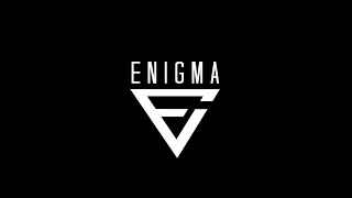
I decided to experiment with different movie production logos that would work well for 'ENIGMA' I played around with the typography, layout, style, alignment, and composition. Going with the monochromatic theme, the text and any visual effects would be light, whilst the background would be dark. To create my movie production logo, I will be using Adobe Photoshop, as it will allow me to create my logo professionally and allow me to adjust any values such as scale easily; I am also experienced with using the program and it will allow me to transfer it to Adobe AfterEffects with ease when I need to animate it for the main movie trailer.


Comments